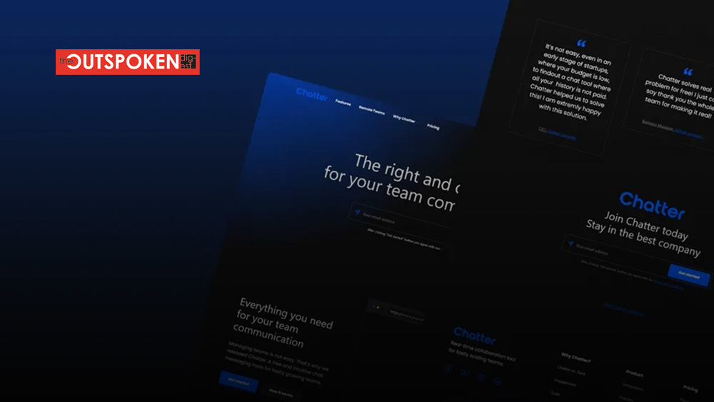
In recent years, dark mode has taken the digital world by storm. From operating systems and apps to websites and social media platforms, the option to switch to a dark background with light text has become increasingly popular. Dark mode not only offers a visually appealing aesthetic but also brings numerous benefits for users, such as reduced eye strain and improved battery life on certain devices. In this blog post, we will delve into the world of dark mode designs, exploring its advantages, implementation techniques, and its impact on user experience.
The Benefits of Dark Mode Designs:
- Reduced Eye Strain: Dark mode reduces the amount of blue light emitted by screens, which can lead to less eye fatigue and strain, especially during extended periods of device usage.
- Improved Visual Contrast: Dark backgrounds provide a high contrast ratio with light-colored text and interface elements, resulting in enhanced readability and easier information absorption.
- Energy Efficiency: On devices with OLED or AMOLED displays, dark mode can save battery life by illuminating fewer pixels, as black pixels require no power.
Dark Mode Implementation Techniques:
- System-Level Dark Mode: Operating systems and popular apps often offer system-level dark mode options that apply the dark theme across various applications, providing a consistent experience.
- Manual Dark Mode Switch: Some websites and apps allow users to manually toggle between light and dark modes based on their preferences.
- Automatic Dark Mode Detection: With the help of browser or device settings, websites and apps can automatically detect the user’s preference and adjust their interface accordingly.
Design Considerations for Dark Mode:
- Color Palette: Selecting the right colors is crucial in dark mode design. Dark backgrounds often work well with muted or contrasting hues, avoiding excessively bright or saturated colors.
- Contrast and Readability: Ensure that text and interface elements maintain sufficient contrast against the dark background to facilitate easy reading and navigation.
- Attention to Detail: Pay attention to the smaller design elements, such as icons, buttons, and form fields, ensuring they are visible and distinguishable in both light and dark modes.
- Accessibility: Dark mode should not compromise accessibility. Consider users with visual impairments and provide alternative options for better readability, such as adjustable text sizes or high-contrast modes.
Impact on User Experience:
- Visual Appeal: Dark mode designs have a sleek and modern aesthetic that many users find visually appealing, creating a sense of elegance and sophistication.
- Focus and Immersion: Dark backgrounds help minimize distractions, allowing users to focus more on the content and reducing eye movement across the screen.
- Nighttime Usage: Dark mode is particularly beneficial during nighttime or low-light conditions, as it reduces the overall screen brightness, preventing discomfort and potential disruption of sleep patterns.
- Branding and Personalization: Dark mode can be used as an opportunity for brands to differentiate themselves and provide a customized user experience, aligning with their brand identity.
Best Practices for Implementing Dark Mode Designs:
- User Preference: Always provide an option for users to switch between light and dark modes based on their personal preference.
- Consistency: Maintain a consistent visual experience across the entire application or website, ensuring that all elements are properly adjusted for dark mode.
- User Testing: Conduct usability testing to gather feedback and identify any readability or accessibility issues specific to dark mode, allowing for iterative improvements.
Dark mode designs have become an integral part of the digital landscape, offering not only a visually appealing experience but also several practical benefits. As designers, embracing dark mode and implementing it thoughtfully can enhance user and reduce eye strain.


