Fashion Has Rediscovered Colour, and Picked Lilac to Prove It
Pantone named Burnished Lilac and Amethyst Orchid for the season while runways ran rainbow brights. After a decade of neutrals, saturation is the statement.
Thursday, August 6, 2026/3 min read
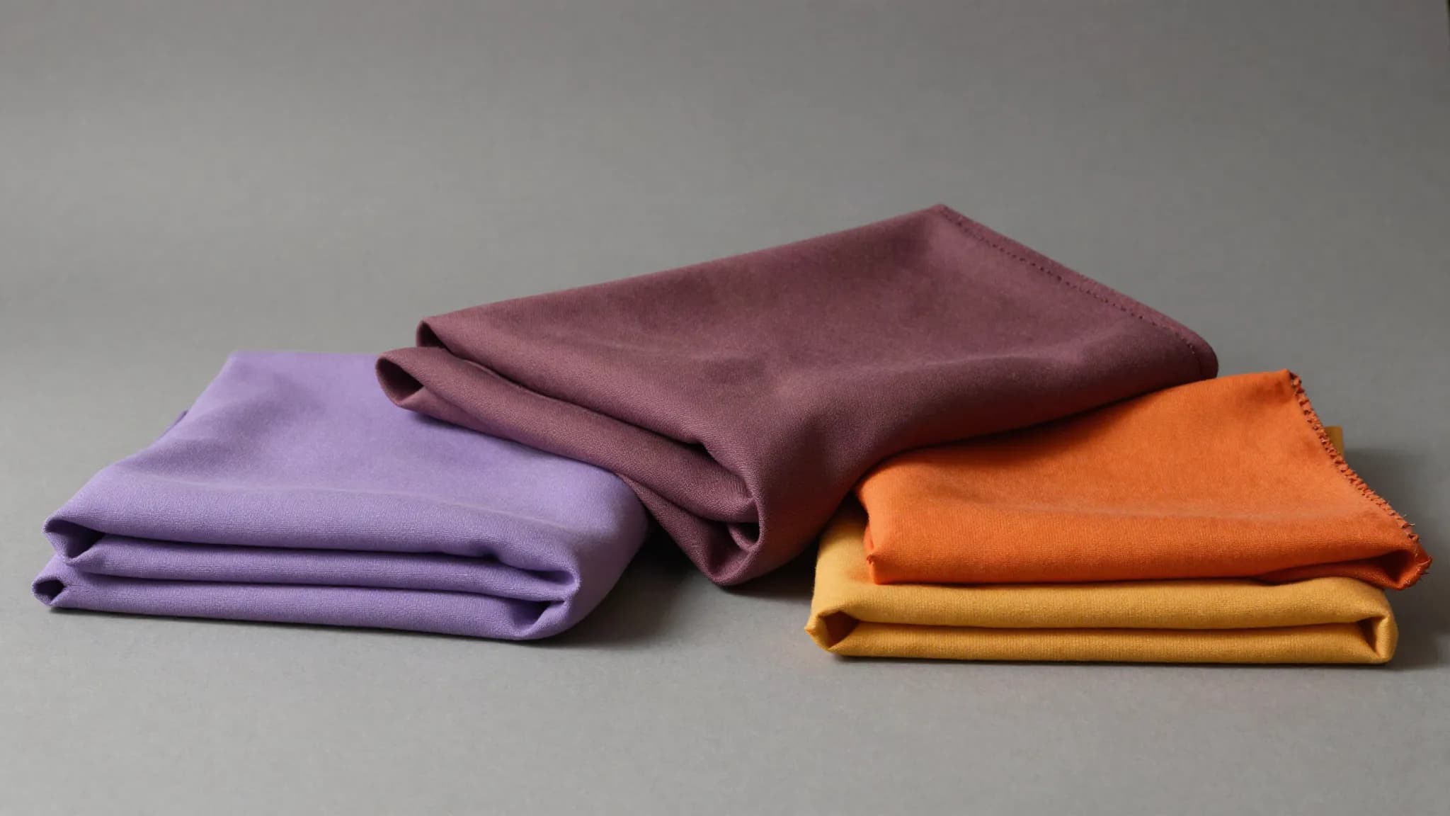
For most of the last decade the safest thing in a wardrobe was an absence of colour. Beige, greige, oatmeal, black. The look signalled restraint, and restraint signalled taste.
That position has become crowded enough to stop meaning anything, and the response has been saturation.
The named shades
Pantone has put forward Burnished Lilac and Amethyst Orchid among its spring and summer directions, as set out in this guide to SS26 colour trends.
Lilac is an interesting choice because it has historically been a difficult commercial colour, read as either juvenile or dated depending on the decade. Burnishing it, taking it toward grey and dust, solves that. It becomes a near neutral that still reads as a colour, which is exactly the compromise a market coming off ten years of beige needs.
Amethyst Orchid does the opposite job. It is unambiguously saturated, and it sits close enough to the burgundy and plum running through autumn to work across seasons.
The runways went further
The catwalks were less cautious. Big houses including Loewe, Dior and Fendi showed rainbow brights in yellow, red and green, with a general move toward bold block colour, according to reporting on the year's style directions.
Block colour is a specific proposition rather than just brightness. It means a single saturated colour across a whole garment or a whole outfit, uninterrupted by pattern or contrast, and it depends entirely on cut. There is nothing to distract from the shape, so the shape has to be right.
That is why block colour tends to arrive alongside strong tailoring, as it has this year. The two support each other.
Why the swing is happening
The obvious explanation is fatigue, and it is partly right. A signal that everyone adopts stops being a signal.
The commercial explanation is more useful. Clothes are now discovered as small images on phones, and neutrals perform badly in that format. Two beige coats are indistinguishable at thumbnail size, while a saturated one is not. When a garment has to earn attention in a scrolling feed before anyone considers buying it, colour is doing measurable work.
The third factor is the one everyone underestimates. People are buying fewer garments, so each purchase has to justify itself more loudly. A neutral justifies itself on quality, which is invisible online. A colour justifies itself immediately.
How to use it without regretting it
Colour trends date faster than shape trends, so the sensible approach is asymmetric.
Put the colour where the money is not. A saturated knit, a shirt, a bag, a pair of shoes will carry the whole look and can be replaced without much pain when the shade moves on. Keep the expensive structural pieces, the coat and the tailoring, in something that survives.
The near neutrals are the exception. A dusty lilac or a soft mushroom behaves like a neutral in practice and will outlast the specific season it was named for, which is precisely why Pantone burnished it.
How a colour of the year actually gets chosen
Colour forecasting is often treated as either prophecy or marketing, and it is neither.
Forecasters work eighteen months to two years ahead of retail, because textile mills need that lead time to dye and weave. By the time a colour is announced publicly, fabric decisions have already been made throughout the supply chain, which is why forecasts tend to be accurate: they are partly self fulfilling.
That is not cynical. It reflects a genuine coordination problem, since an industry with long lead times needs a shared signal to avoid producing thousands of incompatible shades. The forecast is closer to a standard than a prediction.
The interiors crossover
Fashion and interiors colour cycles have converged noticeably, and this year the borrowing runs from clothing into paint rather than the other way.
Benjamin Moore's 2026 colour of the year, an espresso brown with charcoal undertones, was explicitly inspired by tailored suiting, which is a fairly direct acknowledgement of where the influence came from.
The practical consequence for anyone buying either is that a shade appearing in both categories at once tends to last longer than one confined to clothing, because two industries are invested in it and both move slowly.
What to watch next
Watch the high street in early spring. Runway colour is a proposal, and the shade that arrives in volume at accessible prices is the one that has actually been adopted.
Watch also whether grey holds as the season's working neutral. Every colour swing needs something to sit against, and the neutral that survives a maximal period tells you more about where the market is going than the brights do.
Published in The Outspoken Digest
Newsletter
The Digest, in your inbox
One edition, sent when it is ready. No noise, and your address is never passed on.
Read Next
More Fashion →
Victoria's Secret Fashion Show Heads to Los Angeles on Sunday With an All-Women Lineup and Three Angel Hopefuls
Oct 15, 2026/2 min read
Anthony Vaccarello Is Leaving Saint Laurent After a Decade, and Kering Has Not Yet Named His Successor
Oct 9, 2026/2 min read
Louis Vuitton Closes Paris Fashion Week With Hovering Cars, Paper-Light Dresses and a Louvre Courtyard Cityscape
Oct 7, 2026/2 min read
Celine Dion Made a Surprise Return to the Catwalk to Close L'Oreal's Paris Fashion Week Opening Show
Sep 29, 2026/2 min read