The Accent Wall Is Dead. In 2026 the Pattern Goes on All Four Walls and the Ceiling Too
Colour drenching taught people to paint a room in one shade. Pattern drenching takes the next step and wraps the whole envelope, ceiling included, in a single design. It is the loudest interiors idea in years and it is not maximalism.
Thursday, August 20, 2026/4 min read
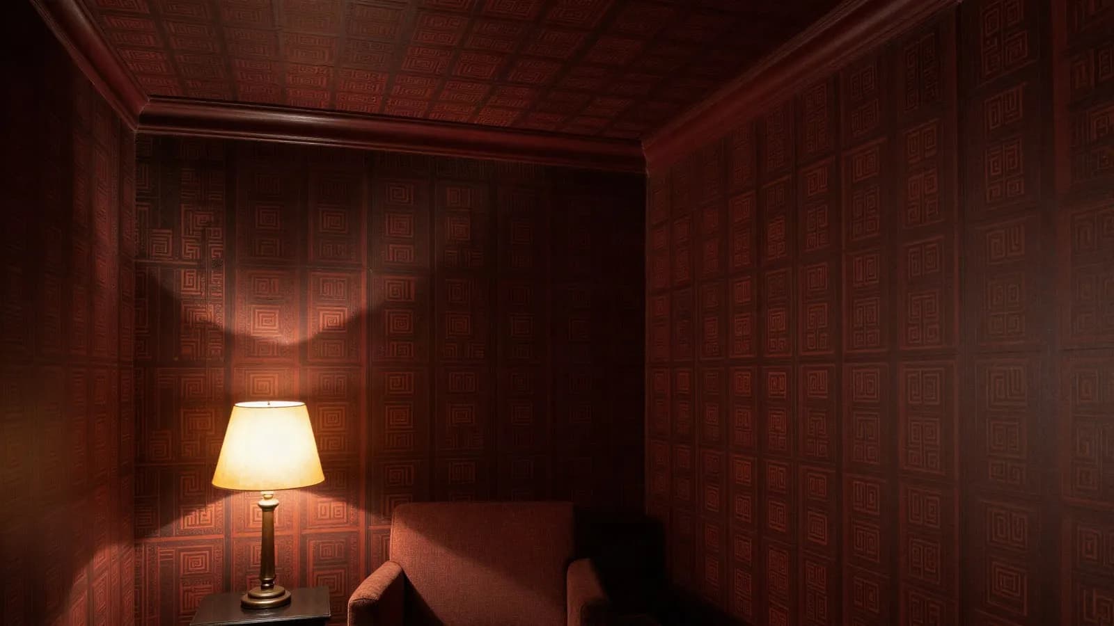
For about two decades the safe way to be brave in a room was the accent wall. One wall in a colour, or one wall papered, and the other three left white so nobody had to commit. It was a compromise that let people say they had done something.
That compromise is what 2026 has decided to abandon. The phrase circulating through design press is that the days of the statement wall are over and we are now talking about statement rooms.
What is pattern drenching?
Taking a single pattern and running it across every surface of a room, rather than deploying it as a feature.
Colour drenching came first and is now familiar: walls, trim, doors, skirting and sometimes the ceiling all in one shade, so the architecture reads as a single volume instead of a set of edges. Pattern drenching applies the same logic to a print.
In its fullest expression, described in the trade as wallpaper drenching, the same paper covers all four walls and the ceiling, which decorators have started calling the fifth wall. The effect is enveloping and deliberately cocoon-like, and it reads as considered rather than busy for a specific reason.
Why does covering everything look calmer than one wall?
Because the eye stops looking for the edge.
An accent wall creates a hierarchy: one surface is the event and the others are background. That contrast is what draws attention to the boundaries of the room and, in a small space, announces exactly how small it is by drawing a hard line around it.
Remove the contrast and the corners dissolve. Without a visual break where the wall meets the ceiling, the brain stops registering the box and reads the space as continuous. This is why drenching often makes a room feel larger, which is the opposite of what people expect from covering it in pattern, and it is the same principle behind the tonal approach in warm minimalism.
Is this maximalism?
No, and the distinction matters if you are going to attempt it.
Maximalism is accumulation: many patterns, many objects, many periods, held together by confidence. Drenching is the opposite discipline. It is one decision, applied completely. The room is loud but it is not busy, because there is only a single idea in it.
That is why it works with restrained furniture and fails with a lot of it. Once the envelope is doing the talking, everything inside has to be quiet, and people who add a drenched room to a full room end up with neither.
What are the palettes?
Brown has become the base, which is the most significant colour shift of the year.
Rich chocolate, warm mocha and deep espresso are being used as the new neutral, stepping into the role black and grey held for a decade while reading softer and warmer. Burgundy remains strong.
Against that, a set of gentler shades is coming forward: butter yellow, cornflower blue, baby pink and pistachio. So the year has two registers, a grounded dark one and a soft pale one, and both are being drenched rather than accented.
On pattern, geometrics are having a sophisticated revival drawing on Art Deco with contemporary colour, and stripe drenching has emerged as its own subcategory. The broader movement is away from stark minimalism and toward layered interiors with expressive pattern, which continues the direction flagged in the return of colour and craft and the retreat from beige noted in the decline of the beige interior.
How do you do it without regretting it?
Four practical constraints, from people who have had to live with the result.
Choose the room by how long you stay in it. This works best in rooms you occupy briefly or dimly: a hallway, a powder room, a dining room used at night, a bedroom. It is harder in a room where you work all day.
Scale down for small rooms, not up. A small pattern drenched across a small room reads as texture. A large pattern in a small room reads as a large pattern in a small room.
The ceiling is where the courage is required and the payoff sits. Skipping it leaves a white lid on the box and undoes most of the effect.
Lighting has to be reconsidered. A drenched room absorbs far more light than a white one, particularly in the darker palettes, so a single central fitting will make it gloomy rather than atmospheric. This is a room that needs the multiple sources described in layered lighting.
How long will it last?
Long enough to matter and not long enough to be safe, and there is already a counter-move.
Colour capping, which leaves the upper section of the wall and the ceiling in a contrasting lighter shade, is being written up as the next paint idea, which tells you the cycle is already turning. Trends in interiors move slower than in clothing because the cost of changing your mind is higher.
The durable part is not the pattern. It is the underlying idea that a room is one volume rather than four surfaces, and that idea has survived several cycles already.
Published in The Outspoken Digest
Newsletter
The Digest, in your inbox
One edition, sent when it is ready. No noise, and your address is never passed on.
Read Next
More Latest Trends →
Lapid Says He Does Not Trust Netanyahu Not to Strike Iran Before Israel's 27 October Election
Oct 18, 2026/2 min read

Hormuz Ship Attacks Hit a Weekly Record as Iran Says a Supertanker Struck a Mine
Oct 18, 2026/2 min read

Trump Waives New Russia Sanctions and Tariffs Two Days Before They Were Due, the Second Waiver in Two Weeks
Oct 18, 2026/2 min read
Roughly Half a Million March Across France as Student Anger Over Schools Merges With Fuel Price Fury
Oct 18, 2026/2 min read