One Colour Authority Named a White for 2026, the Other Named Three Blues, and Designers Are Selling Brown
Pantone chose Cloud Dancer. Dulux broke its own format and chose a family of blues. Meanwhile the survey of what interior designers say clients actually request puts chocolate brown and maximalism at the top. Three answers, one year.
Saturday, August 22, 2026/4 min read
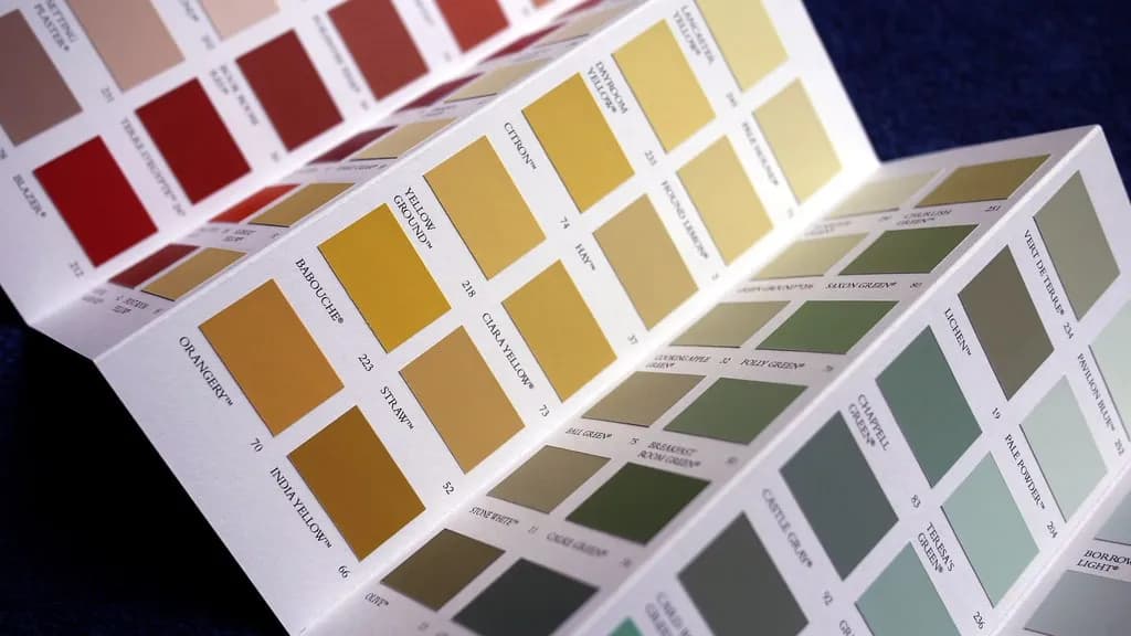
Every autumn a small number of organisations announce a colour for the following year, and a large number of catalogues, paint ranges and product launches quietly reorganise themselves around it. For 2026 the two most followed announcements do not agree, and neither agrees with what designers report their clients are asking for.
That disagreement is more useful than any of the individual choices.
What did they actually pick?
Pantone named Cloud Dancer, described as a billowy, balanced white, a lofty shade offered as a symbol of calm in a society rediscovering the value of quiet reflection.
Dulux named Rhythm of Blues, and in doing so broke its own format. Rather than a single colour it named a family of three: Free Groove, a vibrant cobalt; Mellow Flow, a soft grey blue; and Slow Swing, a deep navy. It is the first time the brand has answered the question with a range instead of a swatch.
A white and a set of blues. One is the absence of a decision presented as serenity, the other is a decision so unresolved it had to be split three ways.
What are designers reporting instead?
Something warmer and considerably louder.
The 1stDibs survey of interior design professionals for 2026 found maximalism the most requested style at 39 per cent, eclecticism close behind at 38 per cent, and chocolate brown named as the top trending colour by 33 per cent of respondents.
Set that against a billowy white and the gap is obvious. The colour authorities are describing a mood, calm and restraint, that the people actually specifying rooms say their clients have moved past. This continues a shift we tracked when beige began losing its grip and again in the return of colour and craft.
Why do the announcements diverge from the market?
Because they are answering different questions, and only one of them involves a client.
A colour of the year is a forecasting product. It is assembled from cultural signals, runway reporting, travel and product data, and it is announced roughly fifteen months before the year it describes, which means it has to be a guess about mood rather than a measurement of demand. It is also, unavoidably, a marketing instrument. A paint company that names a colour sells that colour.
A survey of working designers is the opposite: a lagging measurement of what people are already commissioning. If it says brown and maximalism, brown and maximalism are already in the pipeline.
Neither is wrong. But a reader deciding what to do with a room should know which of the two they are being sold.
Is the fashion answer different again?
Yes, and that is the third data point.
Pantone's seasonal fashion colours ran towards saturation, with Burnished Lilac and Amethyst Orchid named for the season while runways went rainbow bright, which we covered in fashion's rediscovery of colour. So the same organisation is simultaneously telling you that clothing should be saturated and that the year's colour is a white.
These are not contradictions once you notice they address different products on different cycles. They become contradictions the moment they are reported together as a single verdict on 2026, which is how they usually reach the public.
What is the material story underneath?
The part worth acting on, and the part that gets the least coverage.
The consistent thread across the 2026 forecasts is not a hue at all. It is that colour is increasingly being carried by material rather than by paint: reclaimed wood, hand hammered metal, artisan concrete, spun glass. These introduce tonal variation across a surface that a flat coat cannot reproduce, because the variation comes from how the thing was made.
That has a practical consequence. A room finished in one paint colour is a decision that can be reversed in a weekend and will look dated on schedule. A room whose colour comes from the timber, the stone and the metal in it ages differently, because the variation was never a trend statement in the first place.
So what should you do with any of this?
Use the forecasts as vocabulary, not as instructions.
The useful function of a colour of the year is that it makes a shade available. When a major paint brand commits to a blue family, better blues appear across the market, in more finishes, at more price points, for about two years. That is a genuine benefit whether or not you care about the announcement.
The unhelpful function is the implied deadline. Nothing about a room becomes wrong in January. If the three sources with the best data in the industry cannot agree whether 2026 is white, blue or chocolate brown, that is fairly strong evidence that the correct answer is the one that suits the light in the room you are standing in.
Published in The Outspoken Digest
Newsletter
The Digest, in your inbox
One edition, sent when it is ready. No noise, and your address is never passed on.
Read Next
More Design →
Jaguar Type 01 Arrives as a 1,030hp Electric Grand Tourer With No Rear Window and the Concept's Look Intact
Oct 13, 2026/2 min read
Drew Henry Reset Courreges for Spring 2027 With a Pared-Back Debut at the Palais de Tokyo
Oct 1, 2026/3 min read
Choosing Light Bulbs: Lumens, Kelvin and Colour Rendering Explained, Room by Room
Sep 21, 2026/3 min read